昨天我们提到了任意更改基因表达分组阈值生存分析结果大不一样:https://mp.weixin.qq.com/s/pQL8jA38gDPO5xVDG0L94w
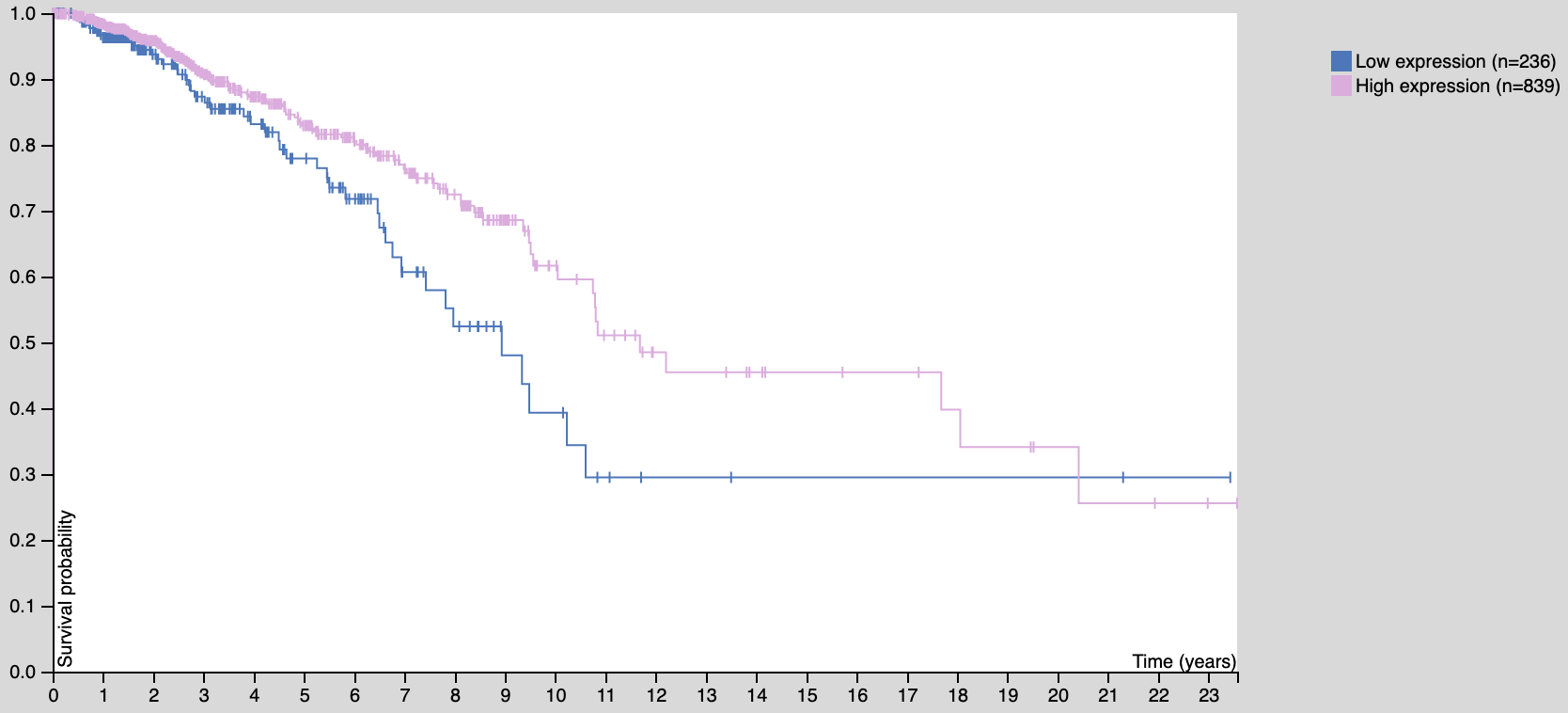
看到https://www.proteinatlas.org/ENSG00000111801-BTN3A3/pathology/tissue/breast+cancer

文字版是:
Based on the FPKM value of each gene, we classified the patients into two groups and examined their prognoses.
In the analysis, we excluded genes with low expression, i.e., those with a median expression among samples less than FPKM 1.
The prognosis of each group of patients was examined by Kaplan-Meier survival estimators, and the survival outcomes of the two groups were compared by log-rank tests.
To choose the best FPKM cut-offs for grouping the patients most significantly, all FPKM values from the 20th to 80th percentiles were used to group the patients, significant differences in the survival outcomes of the groups were examined and the value yielding the lowest log-rank P value is selected.
得到的K-M图如下:

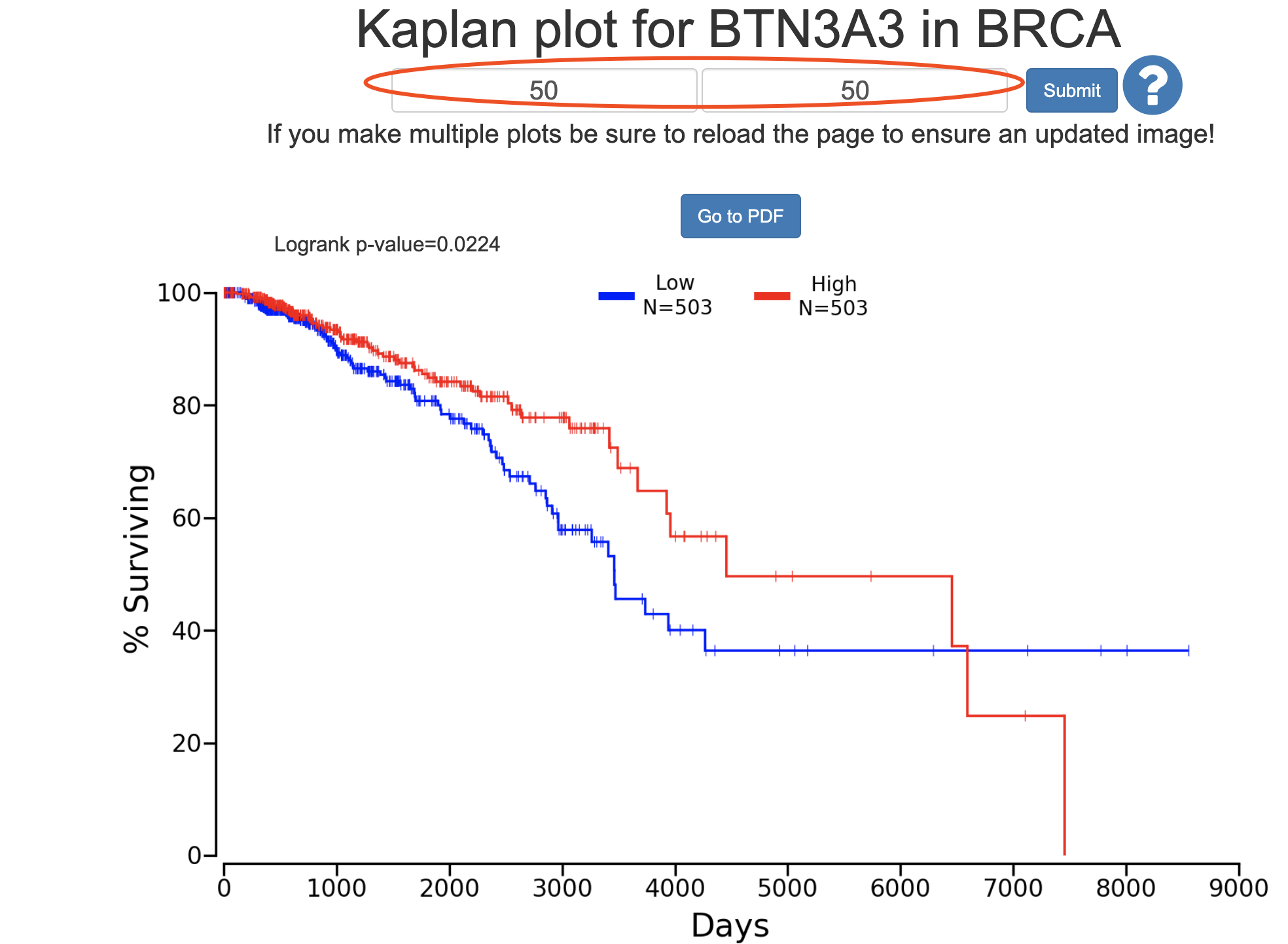
如果是在 http://www.oncolnc.org/ 出图如下:

a=read.csv('BRCA_10384_50_50.csv')
head(a)
a$event=ifelse(a$Status=='Alive',0,1)
library(survival)
library(survminer)
sfit <- survfit(Surv(Days, event)~Group, data=a)
ggsurvplot(sfit, conf.int=F, pval=TRUE)

phe=a
phe$time=phe$Days/365

## 批量生存分析 使用 logrank test 方法
mySurv=with(phe,Surv(time, event))
log_rank_p <- lapply(2:8, function(i){
 thr=sort(phe$Expression)[round(nrow(phe)*i/10)]
 phe$group=ifelse(phe$Expression > thr,'high','low')
 print(table( phe$group ))
 data.survdiff=survdiff(mySurv~group,data=phe)
 p.val = 1 - pchisq(data.survdiff$chisq, length(data.survdiff$n) - 1)
 return(p.val)
})
log_rank_p=unlist(log_rank_p)
log_rank_p

i=8
thr=sort(phe$Expression)[round(nrow(phe)*i/10)]
phe$group=ifelse(phe$Expression > thr,'high','low')
print(table( phe$group ))
sfit <- survfit(Surv(time, event)~group, data=phe)
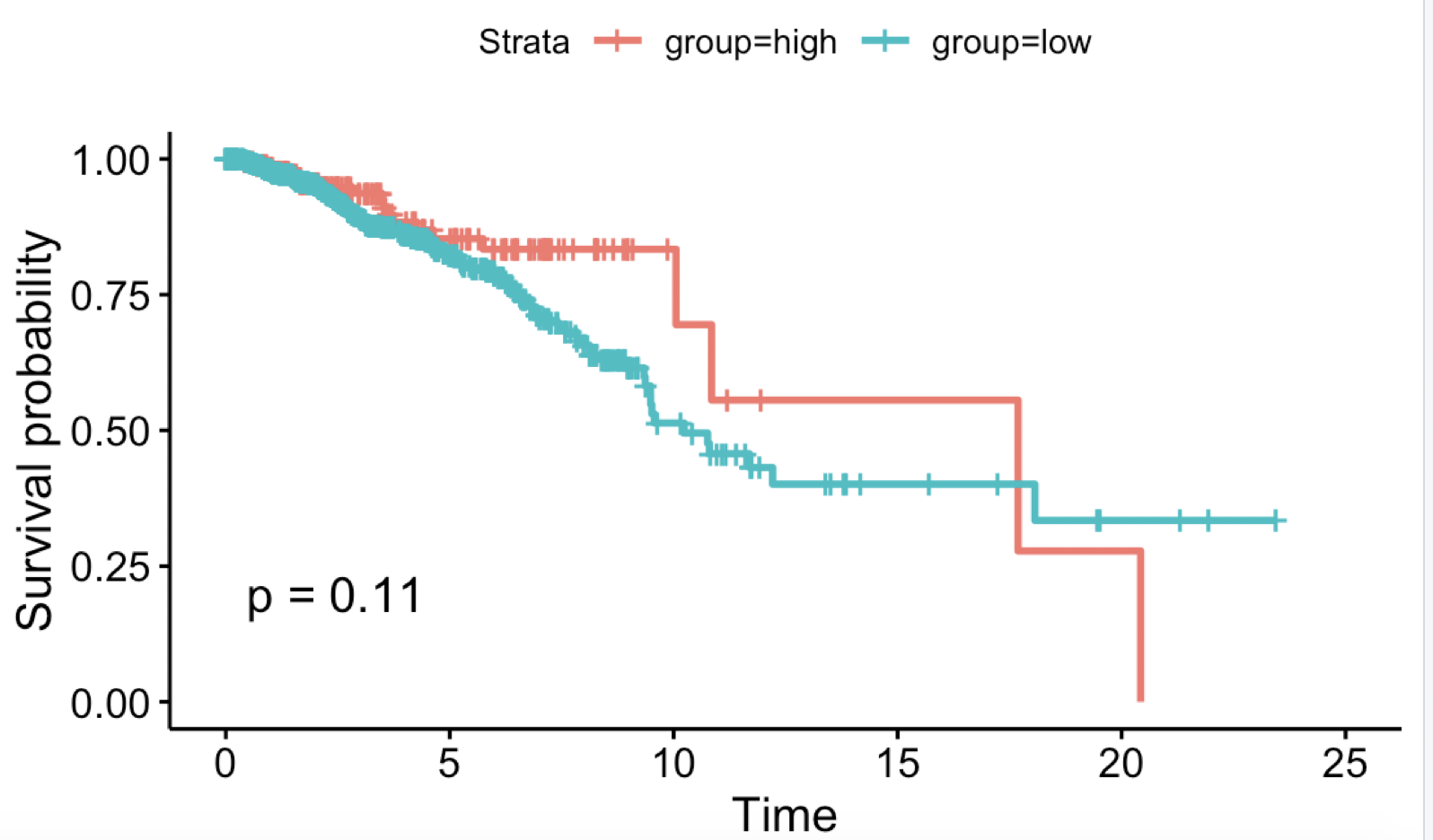
ggsurvplot(sfit, conf.int=F, pval=TRUE)
遗憾的是,因为数据源不一样,使用oncolnc的数据也不太可能画出 proteinatlas 一模一样的图:
