学员在微信交流群分享了一个2024年5月的单细胞数据挖掘文章,标题是:《Single-cell combined with transcriptome sequencing to explore the molecular mechanism of cell communication in idiopathic pulmonary fibrosis》,研究者们重新分析了 GSE122960 这个单细胞转录组数据集,第一层次降维聚类分群后简单的统计了一下每个单细胞亚群的数量,绘制条形图如下所示:
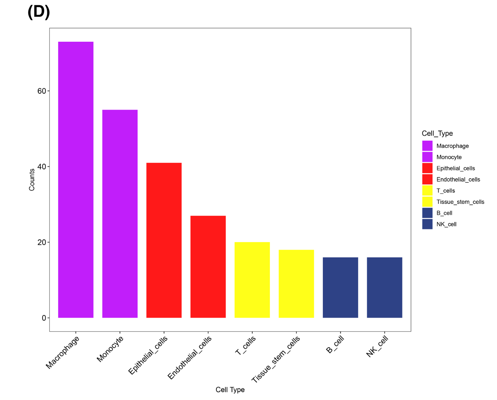
就很迷惑,8个单细胞亚群为什么就使用了4个颜色呢?
R语言配色大全
我比较喜欢下面的4个r包,简单快捷:
- RColorBrewer
- 由Cynthia A. Brewer开发的RColorBrewer包提供了一套精心挑选的颜色方案,特别适合制作地图和数据可视化。
- 它允许用户根据色盲友好性、颜色数量和颜色类型(如序列、发散和定性)选择颜色方案。
- ggsci
- ggsci(ggplot2 scientific)包允许用户在ggplot2的绘图中使用科学期刊的颜色方案,如《Nature》、《Science》等。
- 它提供了一个简单的接口来访问这些颜色方案,使得科研论文和报告的图表颜色更加专业和一致。
- randomcoloR
- randomcoloR包提供了一个函数,用于生成随机颜色方案,这对于需要快速创建颜色方案的用户来说非常有用。
- 它可以生成单色或多色方案,支持用户自定义颜色的数量和亮度。
- paletteer
- paletteer是一个统一的接口,用于访问多个颜色方案包,包括RColorBrewer、ggsci等。
- https://emilhvitfeldt.github.io/paletteer/
- 它提供了一个简单的方式来搜索和选择颜色方案,支持多种参数来定制颜色方案,如颜色的明暗、饱和度等。
使用这些R包,你可以轻松地为你的数据可视化添加专业和吸引人的颜色方案。例如,使用RColorBrewer包时,你可以这样选择颜色方案:library(RColorBrewer) myPalette <- brewer.pal(name = "BuPu", n = 7) # 选择名为"BuPu"的颜色方案,获取7种颜色使用ggsci包时,可以这样使用期刊的颜色方案:
library(ggsci)
ggplot(data, aes(x = x, y = y, color = group)) +
geom_point() +
scale_color_nejm() # 使用《新英格兰医学杂志》的颜色方案
randomcoloR和paletteer的使用方式类似,都提供了直观的函数来生成和应用颜色方案。
randomcoloR包可以生成随机的颜色方案,非常适合当你需要快速创建一个颜色方案时使用。# 安装randomcoloR包 install.packages("randomcoloR") # 加载randomcoloR包 library(randomcoloR) # 生成一组随机颜色 random_colors <- randomColor(5) # 生成5种随机颜色 # 打印这些颜色 print(random_colors)randomColor函数还可以接受参数来控制颜色的亮度和饱和度:random_colors_light <- randomColor(5, luminosity = "light") # 生成亮度较高的颜色 random_colors_dark <- randomColor(5, luminosity = "dark") # 生成亮度较低的颜色paletteer包提供了一个统一的接口来访问多个颜色方案,包括RColorBrewer、ggsci等。详见:https://pmassicotte.github.io/paletteer_gallery/
当然可以。以下是使用R语言和ggplot2包绘制一个简单的条形图的示例代码,并测试上面提到的四个R包(RColorBrewer、ggsci、randomcoloR和paletteer)的配色功能。模拟数据进行条形图可视化并且配色
首先,我们需要安装和加载必要的包:
install.packages(c("ggplot2", "RColorBrewer", "ggsci", "randomcoloR", "paletteer"))
library(ggplot2)
library(RColorBrewer)
library(ggsci)
library(randomcoloR)
library(paletteer)
然后,我们模拟一些数据来绘制条形图:
# 模拟数据
df <- data.frame(
Category = rep(c("A", "B", "C", "D"), each = 2),
Value = c(23, 45, 32, 50, 18, 27, 42, 55)
)
接下来,我们将使用不同的颜色方案来绘制条形图。
使用 RColorBrewer 的颜色方案:
# 选择颜色方案
brewer_colors <- brewer.pal(name = "Set1", n = 4)
# 绘制条形图
ggplot(df, aes(x = Category, y = Value, fill = Category)) +
geom_bar(stat = "identity", color = "white") +
scale_fill_manual(values = brewer_colors) +
theme_minimal() +
labs(title = "Simple Bar Plot with RColorBrewer Colors",
x = "Category",
y = "Value")
使用 ggsci 的颜色方案:
# 选择颜色方案
ggsci_colors <- ggsci::pal_npg("nrc")(4)
# 绘制条形图
ggplot(df, aes(x = Category, y = Value, fill = Category)) +
geom_bar(stat = "identity", color = "white") +
scale_fill_manual(values = ggsci_colors) +
theme_minimal() +
labs(title = "Simple Bar Plot with ggsci Colors")
使用 randomcoloR 的颜色方案:
# 生成随机颜色方案
random_colors <- randomColor(4)
# 绘制条形图
ggplot(df, aes(x = Category, y = Value, fill = Category)) +
geom_bar(stat = "identity", color = "white") +
scale_fill_manual(values = random_colors) +
theme_minimal() +
labs(title = "Simple Bar Plot with Random Colors")
使用 paletteer 的颜色方案:
# 选择颜色方案
paletteer_colors <- paletteer::paletteer_d("rcartocolor::Geyser")
# 绘制条形图
ggplot(df, aes(x = Category, y = Value, fill = Category)) +
geom_bar(stat = "identity", color = "white") +
scale_fill_manual(values = paletteer_colors) +
theme_minimal() +
labs(title = "Simple Bar Plot with paletteer Colors")
运行上述代码后,你将得到四个不同的条形图,每个都使用了不同的颜色方案。这些示例展示了如何轻松地在
ggplot2中应用不同的颜色方案来增强数据可视化的视觉效果。